[Improve Your Illustration Skills] For days when you don't feel like drawing! 3 'mental practice methods' to dramatically improve your drawing skills without holding a pen.
Pochi
Reading in the sun and reading in the rain.
Hi, this is Shirayuki Pochi.
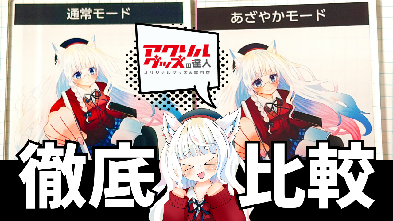
We are pleased to announce a new option from "The Master of Acrylic Goods".Selectable Print Mode CampaignI won.
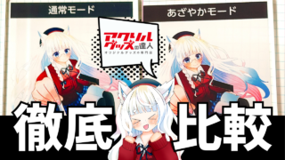
This time, I actually got to try it out.“Print results and impressions of "Vivid Mode," and the difference in finish compared to normal mode.This summarizes them.
I'm an expert in acrylic goods, and I hope this will be helpful for anyone who wants to try making acrylic keychains or acrylic stands.
The master of acrylic goods, as the name suggestsA printing company specializing in acrylic productsIs.
It is easy for individuals to use,You can order from just one item.That is its main characteristic.
Our product range includes acrylic keychains and acrylic stands, as well as wooden keychains and other items, so you can choose according to your needs.
The submission process is easy to understand, and with the assistance service (from 1,650 yen as of October 2026), major formats such as jpg, png, PDF, ai, psd, and bmp are supported.
The system is designed to be easy to use, even for people creating merchandise for the first time.
This time, the "Acrylic Goods Master" was conductingSelectable Print Mode CampaignI won.
The reason I applied was because I happened to come across this post on X.
I was curious to see what the final result would be like, so I decided to apply.
Although I had known about the existence of the acrylic goods expert for some time, I had very little information about the color tones and finish characteristics of their prints.
Therefore, this time I'd like to share my impressions after actually seeing the printed materials that arrived.I write my reviews with the aim of being as honest as possible.
After winning, you will receive an email with instructions, and then you will send the data.You can print and compare two modes, Normal Mode and Vivid Mode, for free.That was the gist of it.
It's rare to have the opportunity to compare the finished product using the same illustration data, but simply by changing the print mode.
This is an experience I would never normally get to have during my regular creative work, so as a creator, I felt it was a very valuable project.
In this campaign,Normal modeとVivid ModeWe were able to compare these two types.
Each method has its own unique characteristics, and the resulting finish is clearly different depending on the approach.
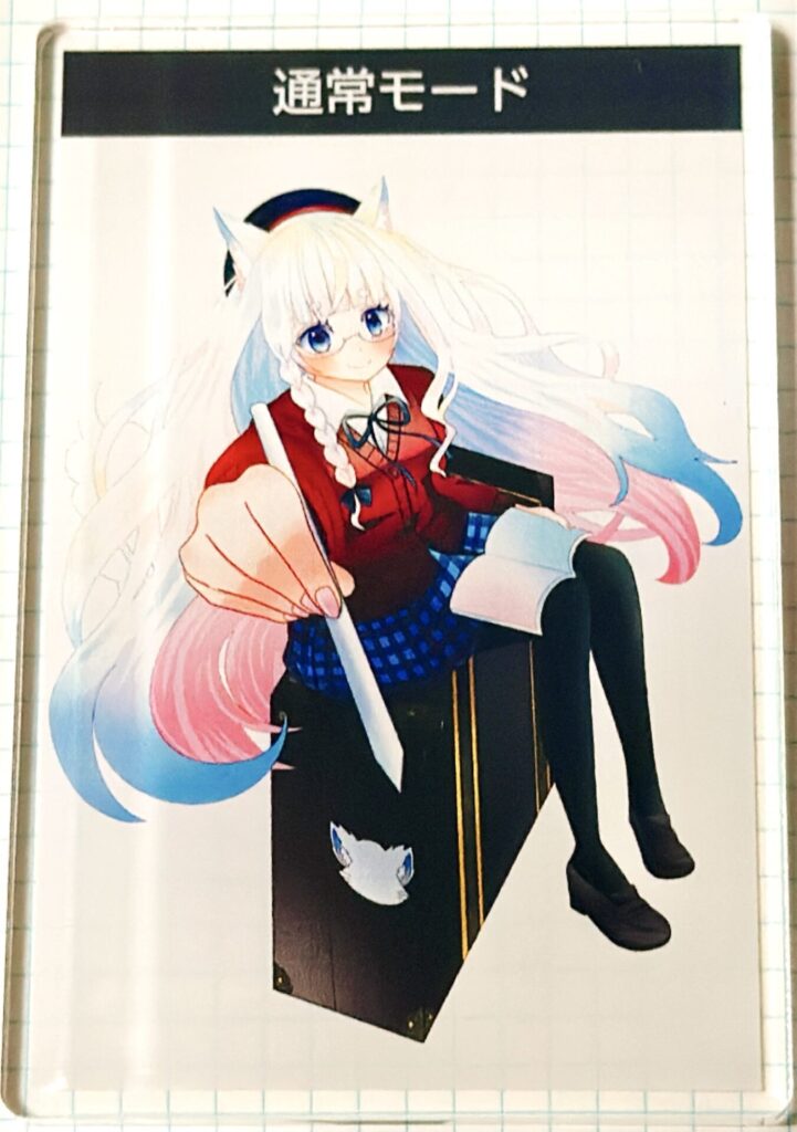
This is a long-established, standard printing method that ensures consistent results regardless of the data.
The color reproduction is stable.
The contrast is subtle.
It's versatile and easy to match with a wide range of designs.
It gives an overall calm impression and is suitable for works where you want to maintain a gentle atmosphere.
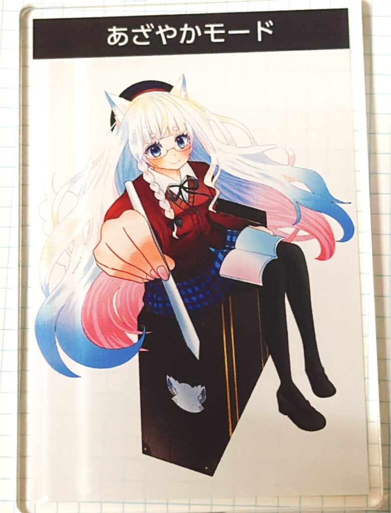
This is a new printing mode optimized for illustrations with soft colors, muted colors, and a translucent quality.
It seems to work particularly well with illustrations that use a lot of light colors, or with data where color fading is a concern.
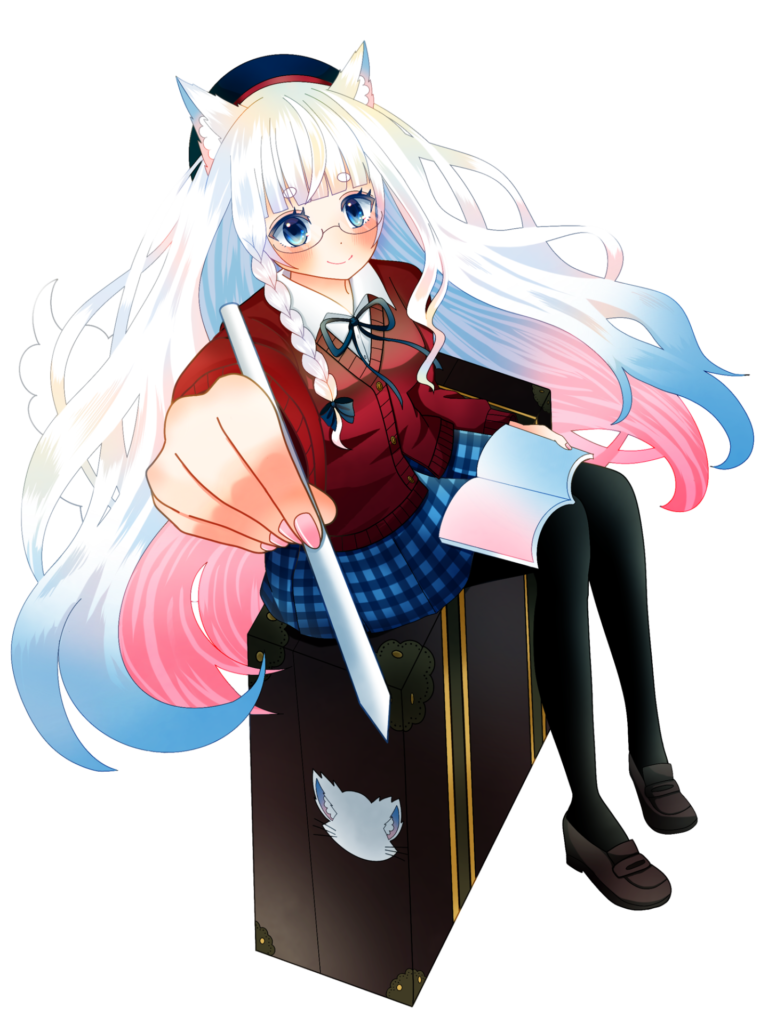
For this comparison, we used illustrations that include both light and dark colors.
I felt that data with a wide range of colors was the easiest way to see how well the features of the vivid mode would be displayed.
What particularly caught my attention were the soft pink and light blue gradients, and the highlights that were almost white.
I chose this illustration because these areas tend to lose their color intensity or nuance during printing, and I thought the differences depending on the printing mode would be quite noticeable.
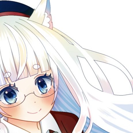
First, we checked the differences in print modes in the line art of the hair, which uses particularly light colors in the illustration.
Although there may be slight differences in appearance due to the comparison being based on photographs, both were taken under the same conditions.
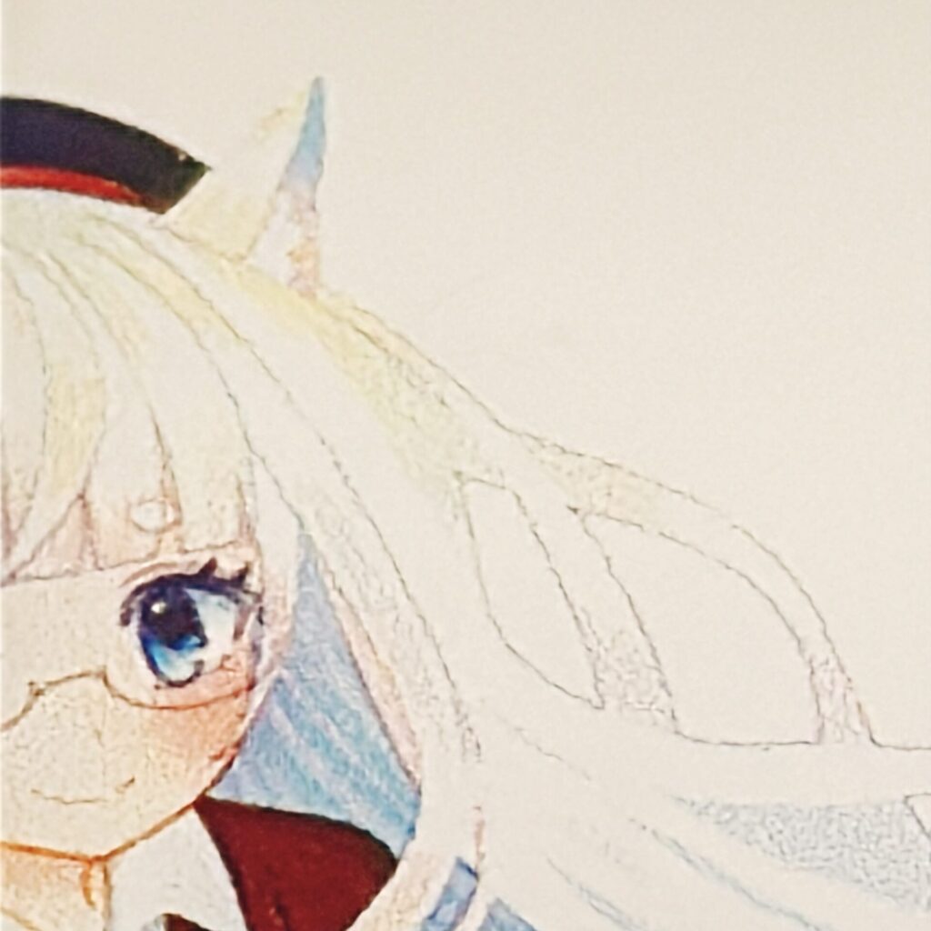
Normal mode
Although the lines are slightly fainter, they are still easily visible.
The eye color is close to the original illustration, resulting in a natural finish.
The gradation on the ears is subtle and gives a soft impression.
Skin appears whiter and brighter than in the vibrant mode.
Darker colored areas, such as clothing and hats, appear more vibrant in normal mode.
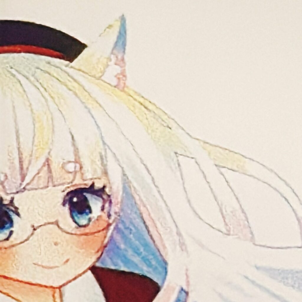
Vivid Mode
Even with faint line drawings, the outlines are clearly visible, and the details are easy to understand.
The subtle color gradation is beautifully reproduced.
The darker parts of the eyes are slightly emphasized, which changes the overall impression.
The gradient on the ears is more clearly rendered than in normal mode.
The skin tone appears healthy, and the overall contrast seems to have improved.
While lighter colors come out clearly, areas with many darker colors may appear slightly darker.
Normal mode
The light colors are somewhat subdued, creating an overall calm atmosphere.
The parts where the line is lighter in color are a little hard to see.
The darker areas will be reproduced with colors close to the original illustration.
The boundary between the shoes and tights is clearly visible.
The yellowish tint on the chest area looks beautiful.
Vivid Mode
The overall impression is sharp and the contrast is strong.
Because the darker areas appear slightly darker, it's difficult to distinguish the boundary between the shoes and tights.
The yellow on the chest area is more subdued than in the normal mode.
The subtle gradient is close to the original image and reproduced beautifully.
Even though the line art is faint, the outlines appear clear.
The contrast is increased, resulting in a more impactful finish.
Normal mode isSuitable for works where you want to maintain a soft atmosphere.。
Vivid mode isThis impression is suitable when you want to enhance the presence of an illustration.Is.
I felt it was a good match for illustrations that primarily use dark colors, or for works where a calm color palette is important.
This is suitable when you want to maintain an overall soft look or when you want to reproduce the original color of the darker areas exactly as they were.
Through this campaign, I realized that even with the same data, simply changing the print mode can drastically alter the final appearance.
Rather than one being superior to the other, I get the impression that using them interchangeably depending on the direction of the work broadens the range of expression.
I found it very reassuring to be able to choose the print mode depending on how I want to present my illustrations.
This has added yet another layer of enjoyment to making acrylic goods.
This time too, my usual partner iPad Air × Procreate × Apple Pencil It was created using a combination of these elements.
The Apple Pencil makes it easy to draw even in small areas, and I feel it's a really good match for my drawing style.
For acrylic goods experts, I was able to easily submit my designs from my smartphone using PNG files.
Please note that some products can only be submitted via PC.
If you found this article helpful and would like to support it,
Receiving encouragement from OFUSE is very motivating.
Your support will be instrumental in creating illustrations and updating my blog.
Thank you very much for reading to the end.
Thanks to everyone who always reads my work, I can continue to create.
I look forward to your continued support.
Trying out the printing mode made me realize once again how fun it is to create merchandise.
The following article summarizes my experience of actually making an acrylic keychain at Otaclub.
If you'd like to know how to submit your artwork using only an iPad and what to keep in mind, please check this out as well.
 A comparison review of printing modes used by experts in acrylic goods! We explain the difference between normal mode and vivid mode.
Comparing the different printing modes gave me an opportunity to rethink how I present my work.
In the following article, I've summarized my insights into creating illustrations, drawing inspiration from the style of Shigure Ui.
If you're interested in the drawing process, please check this out as well.
A comparison review of printing modes used by experts in acrylic goods! We explain the difference between normal mode and vivid mode.